
Context
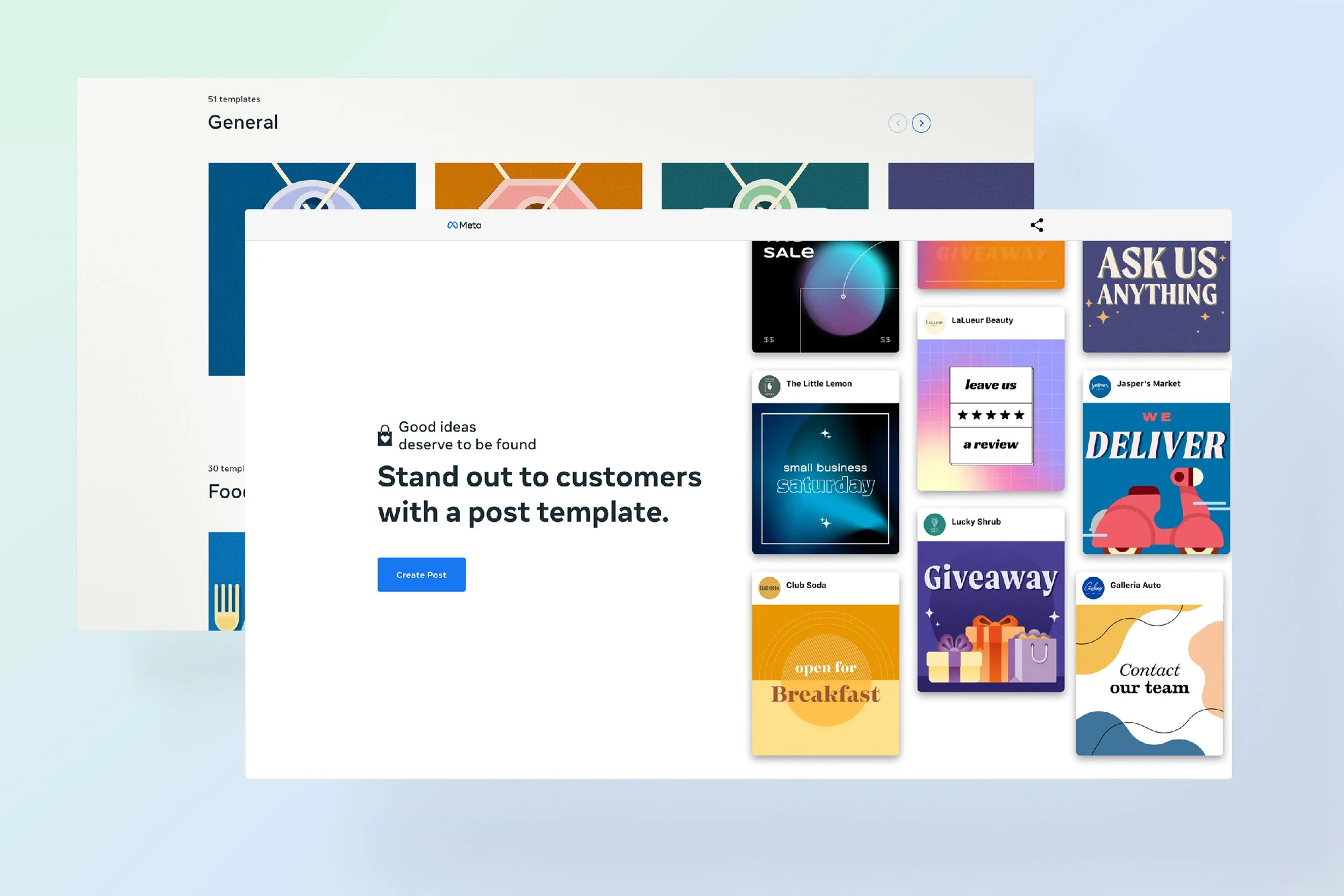
By the time this redesign started, the template catalog had grown from 45 to 135, mobile had taken over as the primary entry point, and the Meta rebrand was reshaping the design language. The old UI couldn’t hold any of that.
The audience is small-business advertisers on Facebook, Instagram, WhatsApp, and Messenger who spend less than $5,000 per quarter on ads. About 10 million of them, split across four regional segments: Asia Pacific; Europe, Middle East & Africa; Latin America; and North America.
Why the Hub needed an update
 Template growth. The catalog grew from 45 to 135 across three styles, outpacing the old filtering UI.
 Mobile-first behavior. Mobile was the primary entry point, and user behavior diverged from desktop assumptions.
 Low-engagement zones. Large areas of the page pulled users away from the download flow. They needed to be rethought or dropped.
 Rebrand to Meta. Facebook’s rebrand updated the design system and color palette, so the Hub had to inherit the new visual language.
Market context
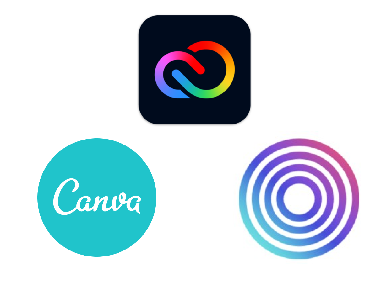
The DIY-design market has grown alongside social-media marketing. Canva leads with 21% market share. Adobe, long the leader in professional design, has shifted focus toward novice-friendly products. Ripl is a subscription mobile-first alternative that shares features with both.
User journey
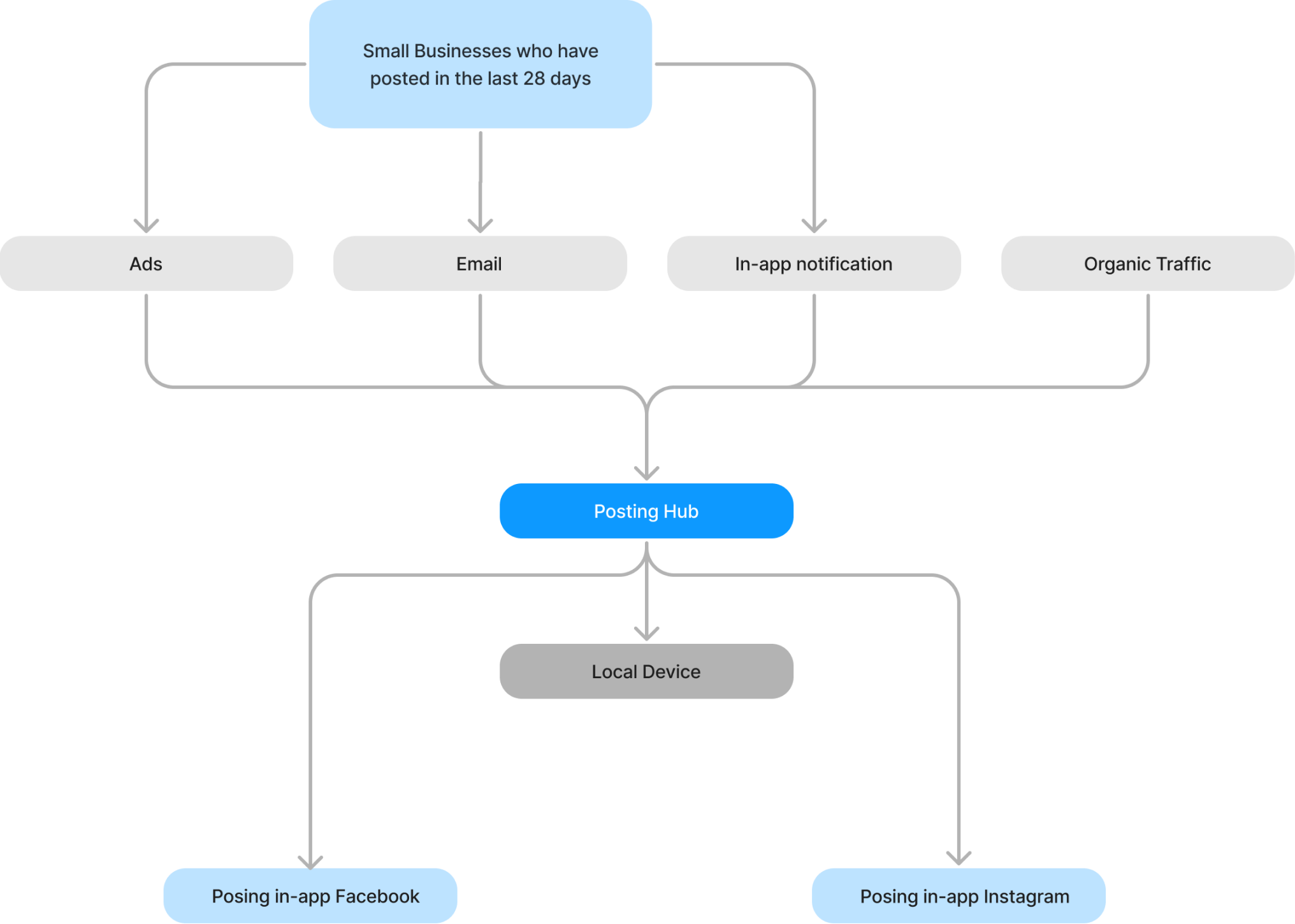
The path into the Hub usually starts with an email or in-app notification to a small business that has posted in the last 28 days. Once there, users browse, filter, and download templates directly to their device. Organic search is a secondary entry point.
Design
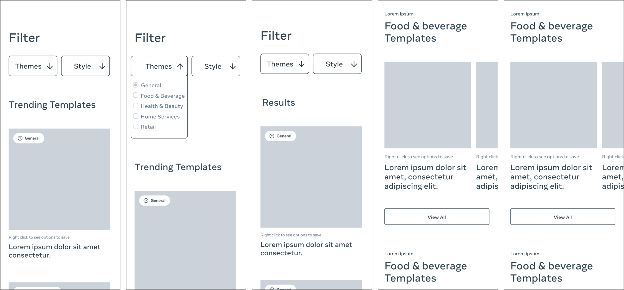
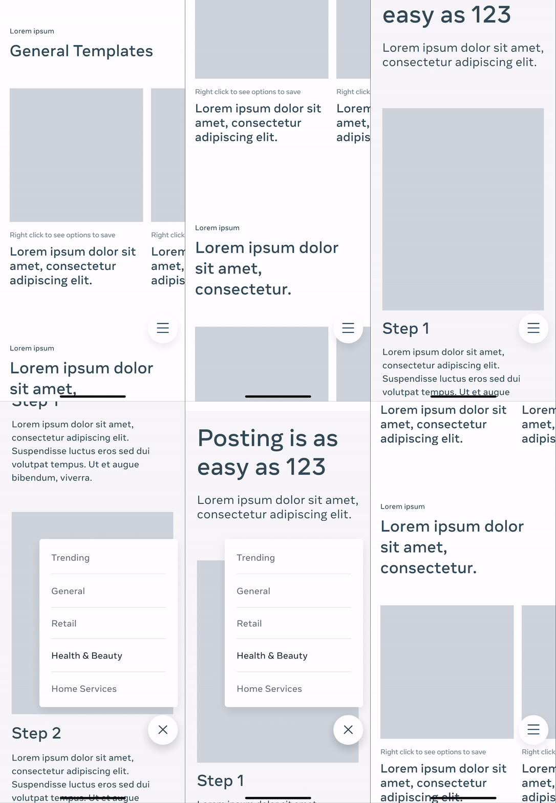
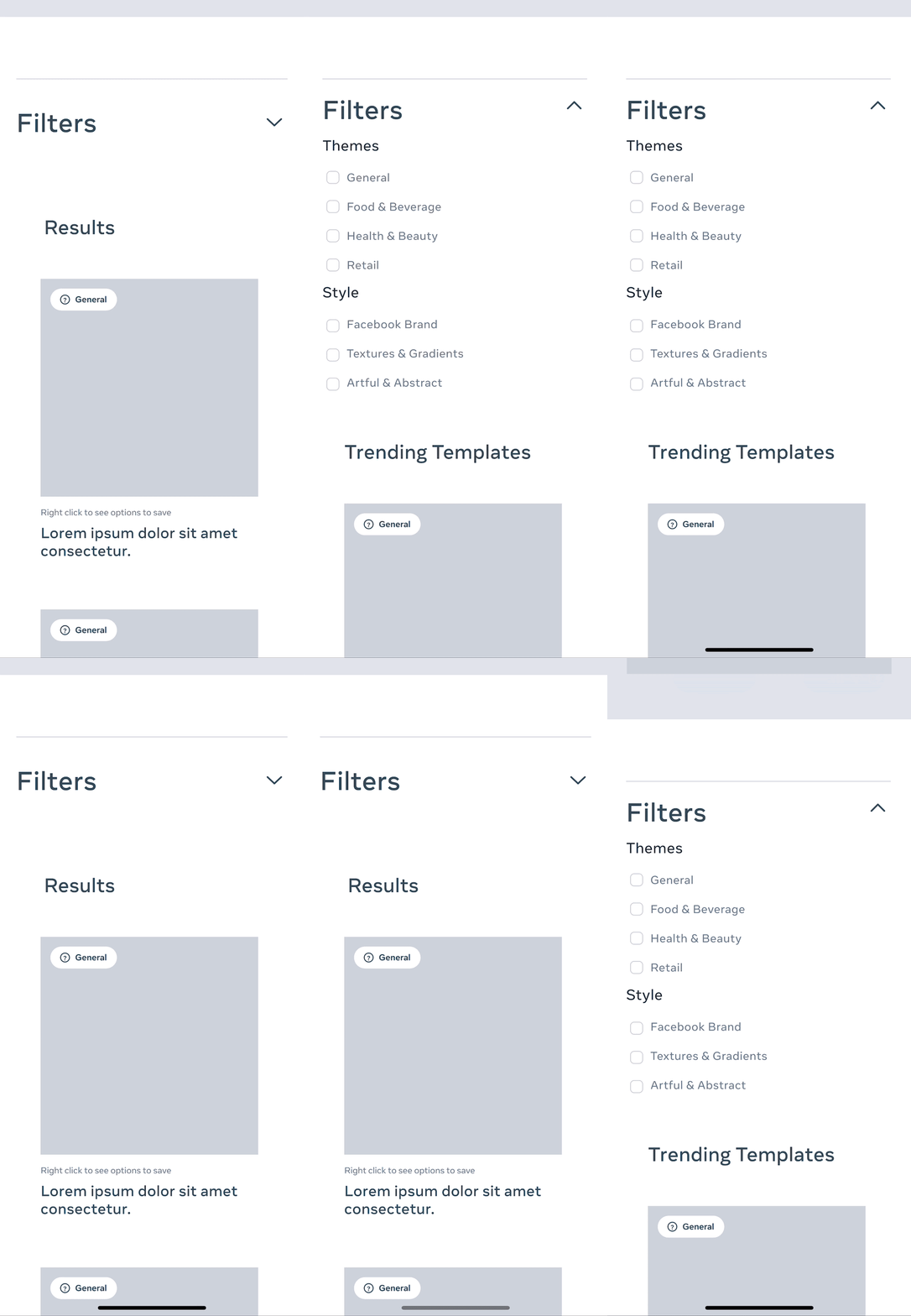
I picked up the Hub redesign after the first iteration had landed with stakeholders. Starting from that work, the competitive audit, and the user journey, I took a second pass through five wireframe concepts, then built low-fidelity prototypes so the interaction patterns could be tested before committing to visual direction.
Final design
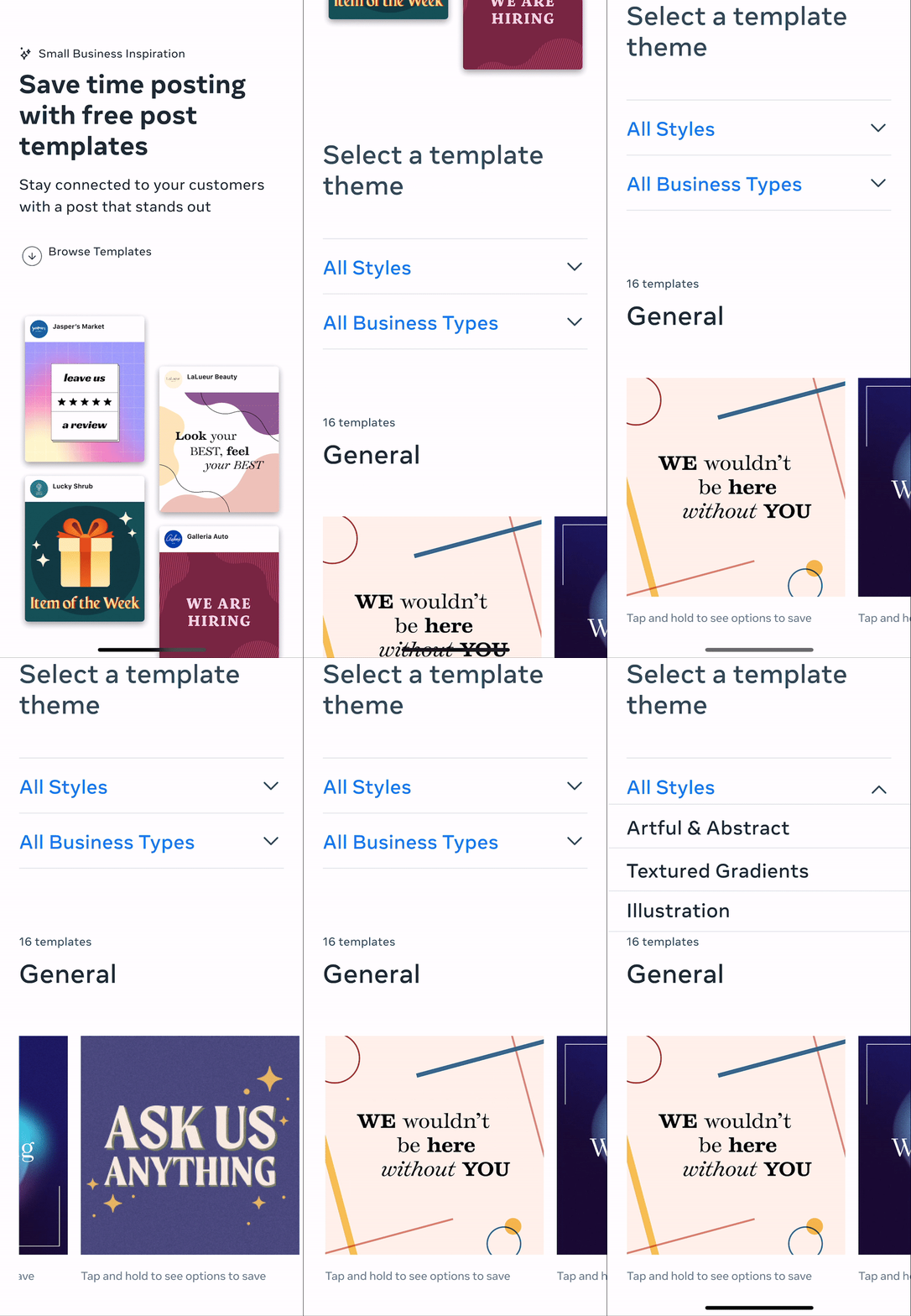
The filtering question came down to one decision: two dropdowns, one for style, one for business type. The combination lets a user tailor the template set to their specific use case without hunting through a flat catalog.
Metrics
Regional CTR
What I took from it
Regional CTRs tell a specific story: Latin America responded best, Asia Pacific lagged. That gap points to a localization pass in the next iteration rather than a UI problem. Mobile visitors were double desktop, but click-through ratio was higher on desktop. And the emails and ads driving traffic hadn’t been updated to match the new landing page. Closing that loop is the next move.