Context
250,000 new Facebook Pages were being created every day. 60% churned in the first week. The Advertiser Success Center was sorted by skill tier, not by the questions advertisers were actually trying to answer.
This restructuring happened alongside Facebook’s rebrand to Meta, which reduced the company color palette from 90 colors to 6. Any navigation pattern that had been leaning on color now had to work without it.
What the old hub was doing wrong
Content on the primary hub page shifted before users could review it, so advertisers couldn’t tell what had changed between visits. On sub-pages, color use was purely aesthetic: no relationship between a color and the content it wrapped. Each sub-page had a different hierarchy, so learning one page didn’t help you navigate the next.
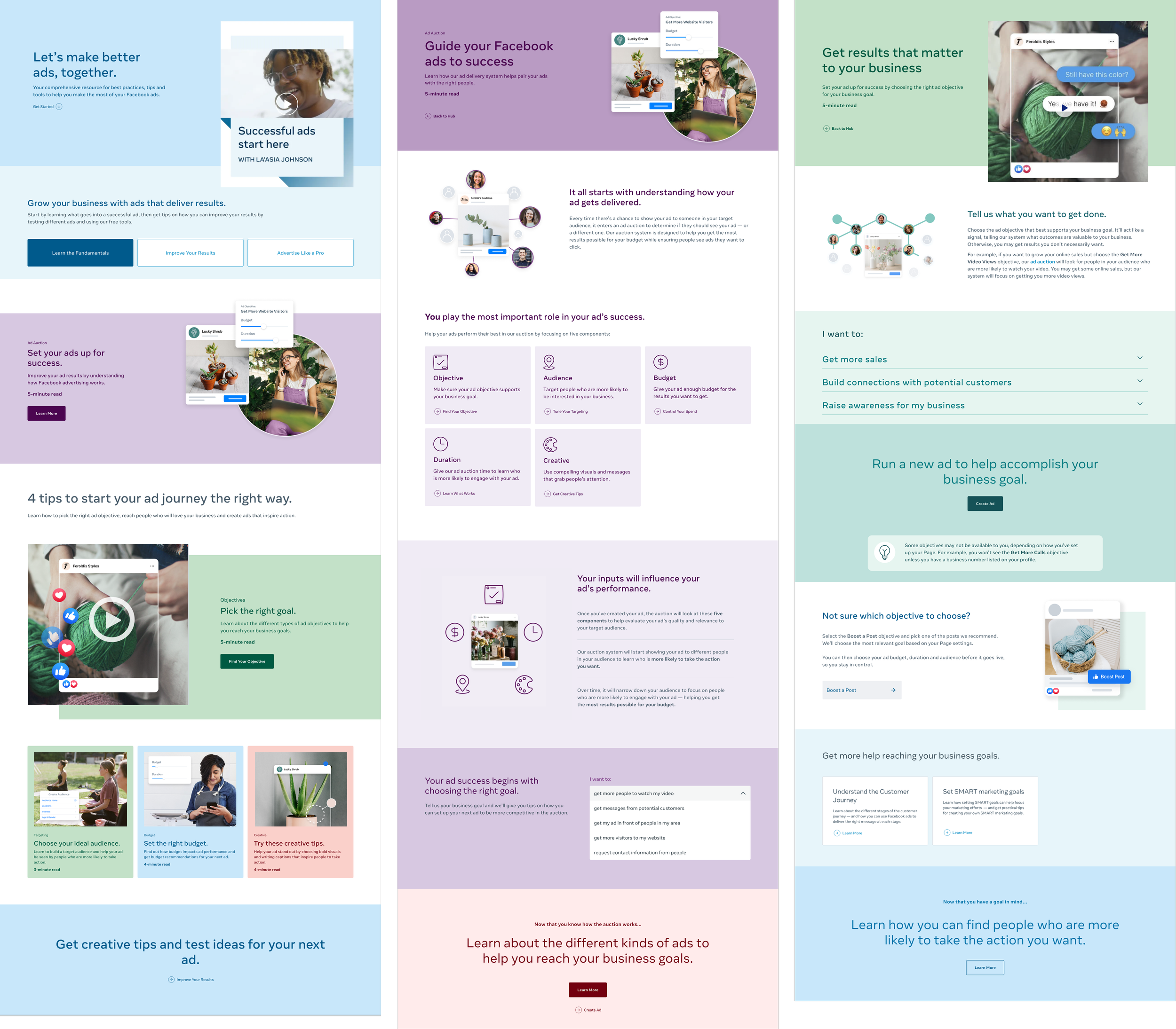
The audit turned up the structural problem underneath all of those symptoms. The old hub sorted content by who was reading it (Beginner, Intermediate, Pro) rather than by what that person was trying to do.
The category shift
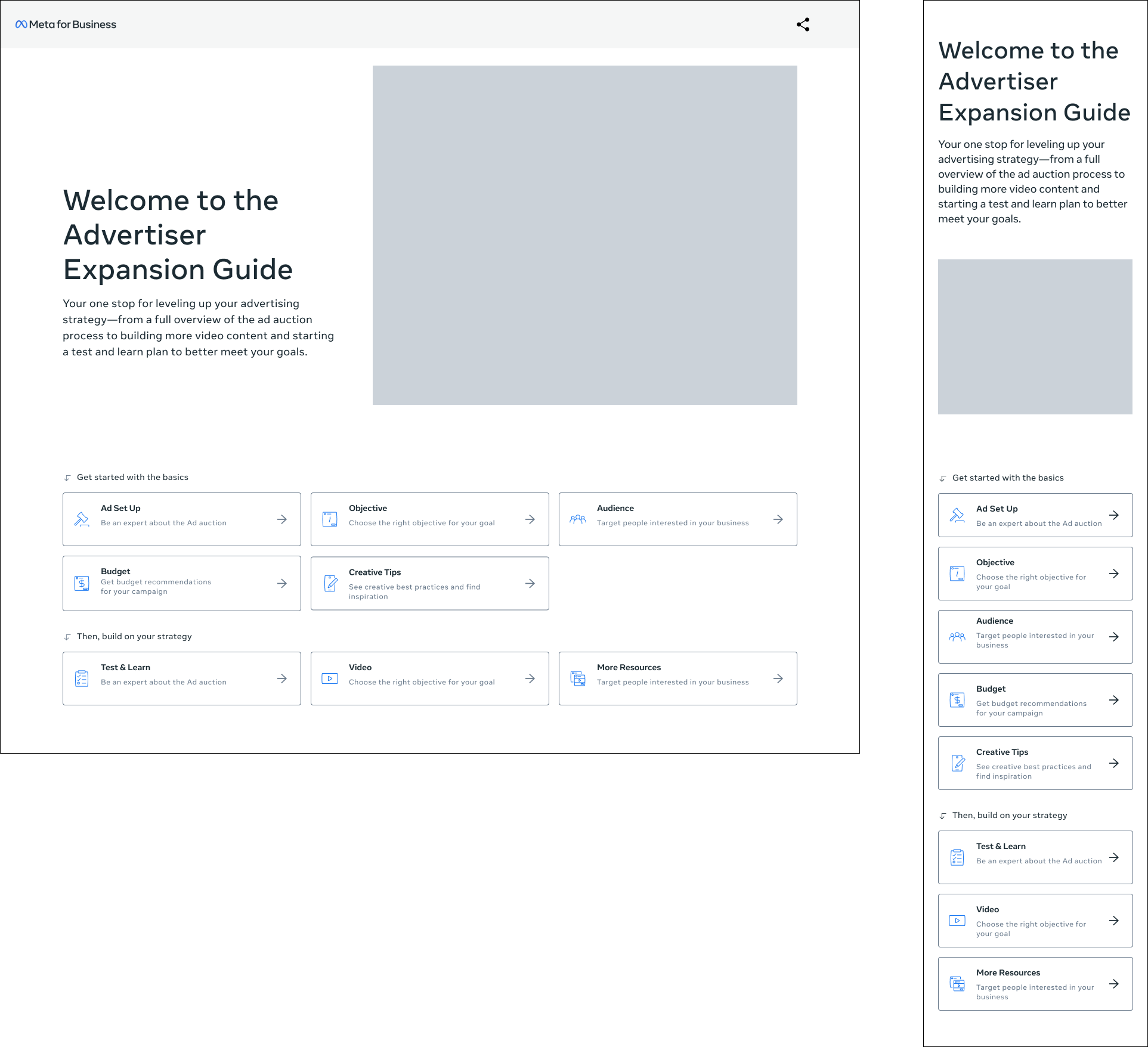
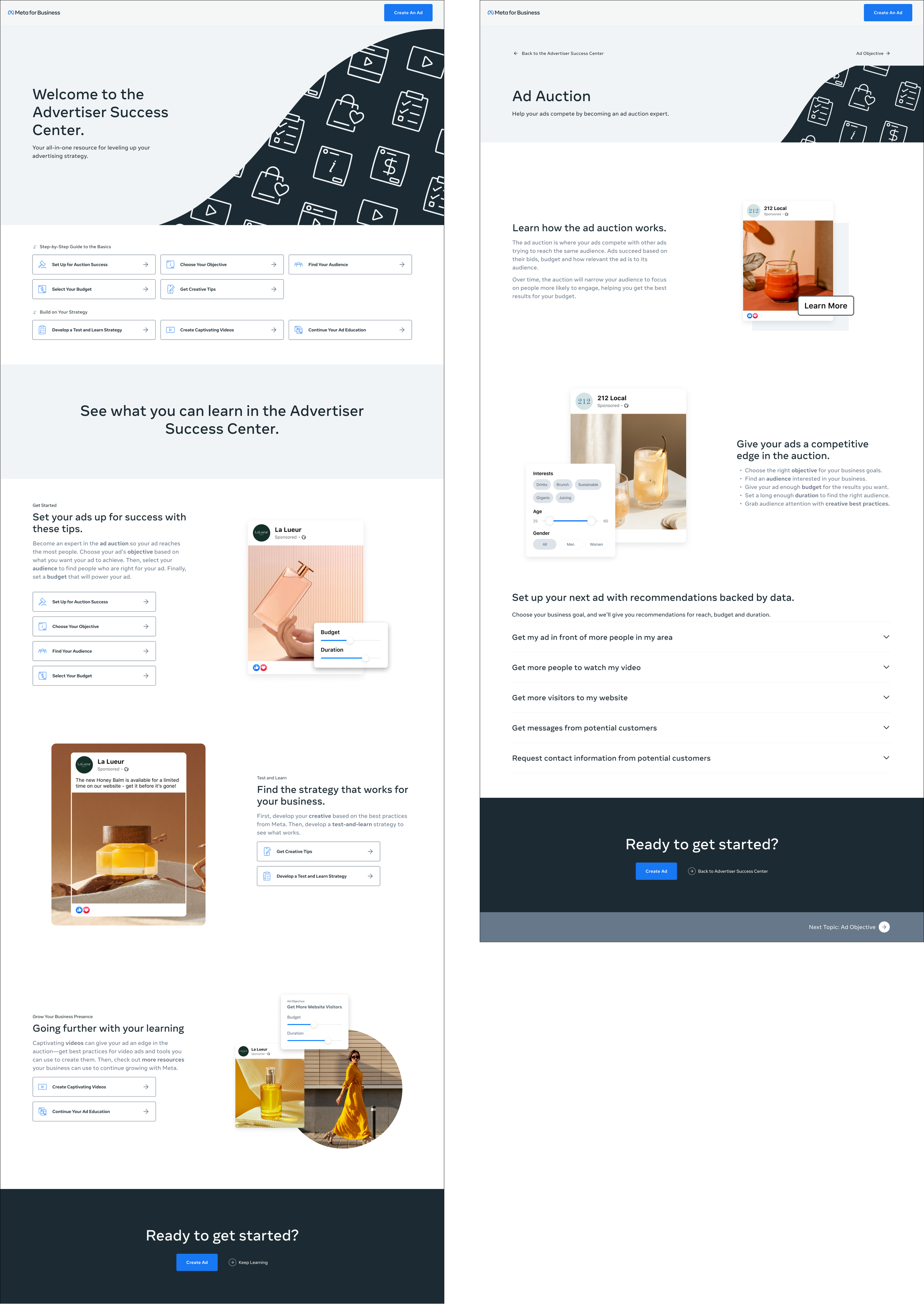
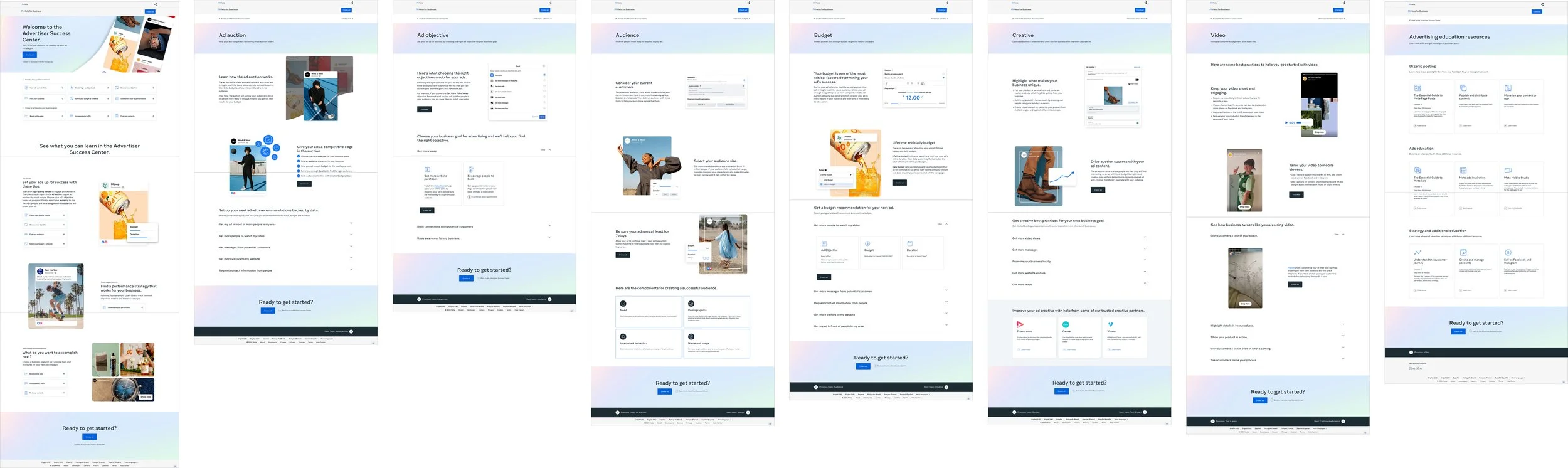
The main move was to replace the skill tiers with categories that matched how advertisers actually think about their work: Ad Auction, Ad Objective, Audience, Budget, and so on. Same content, reorganized around the user’s question instead of the platform’s taxonomy.
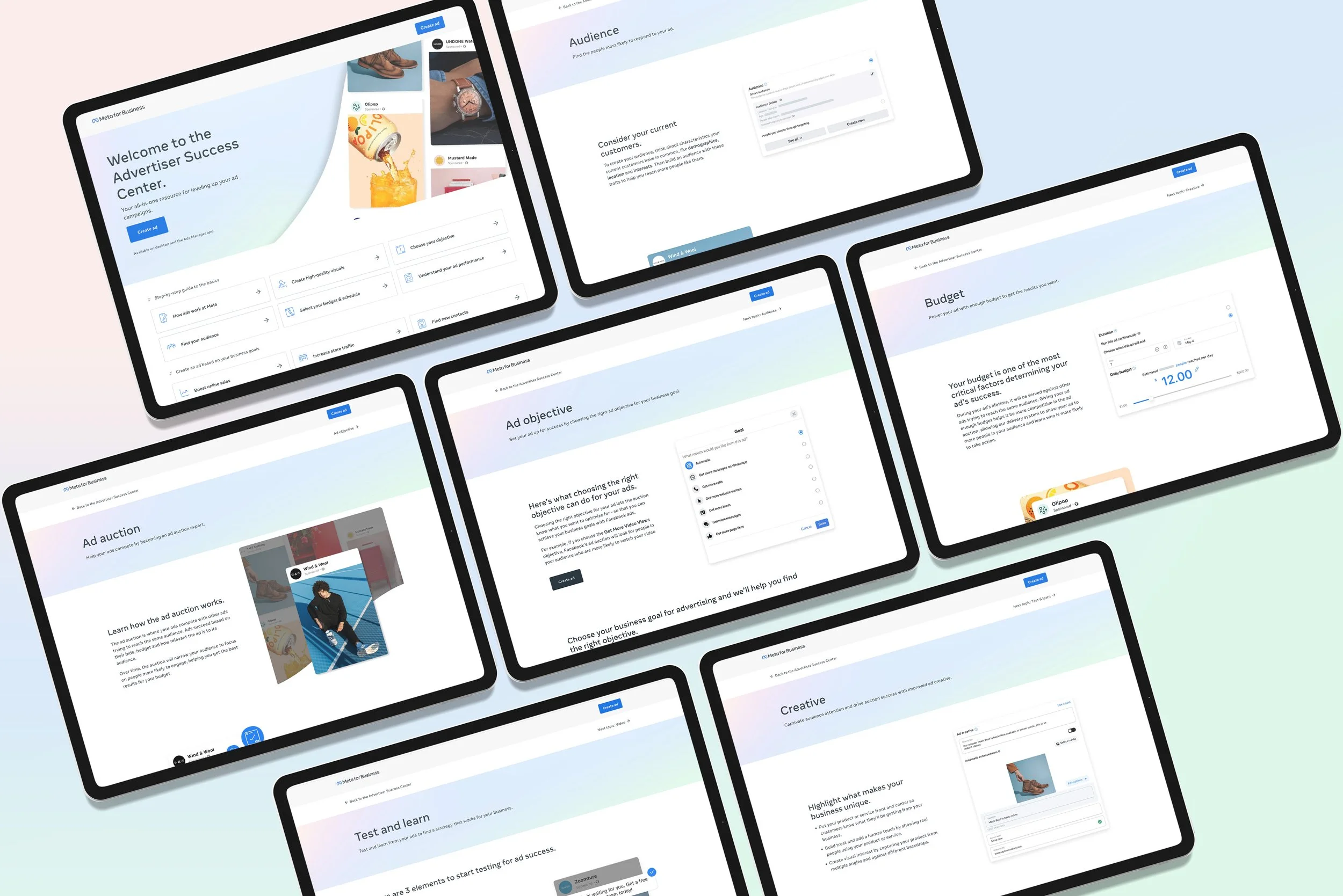
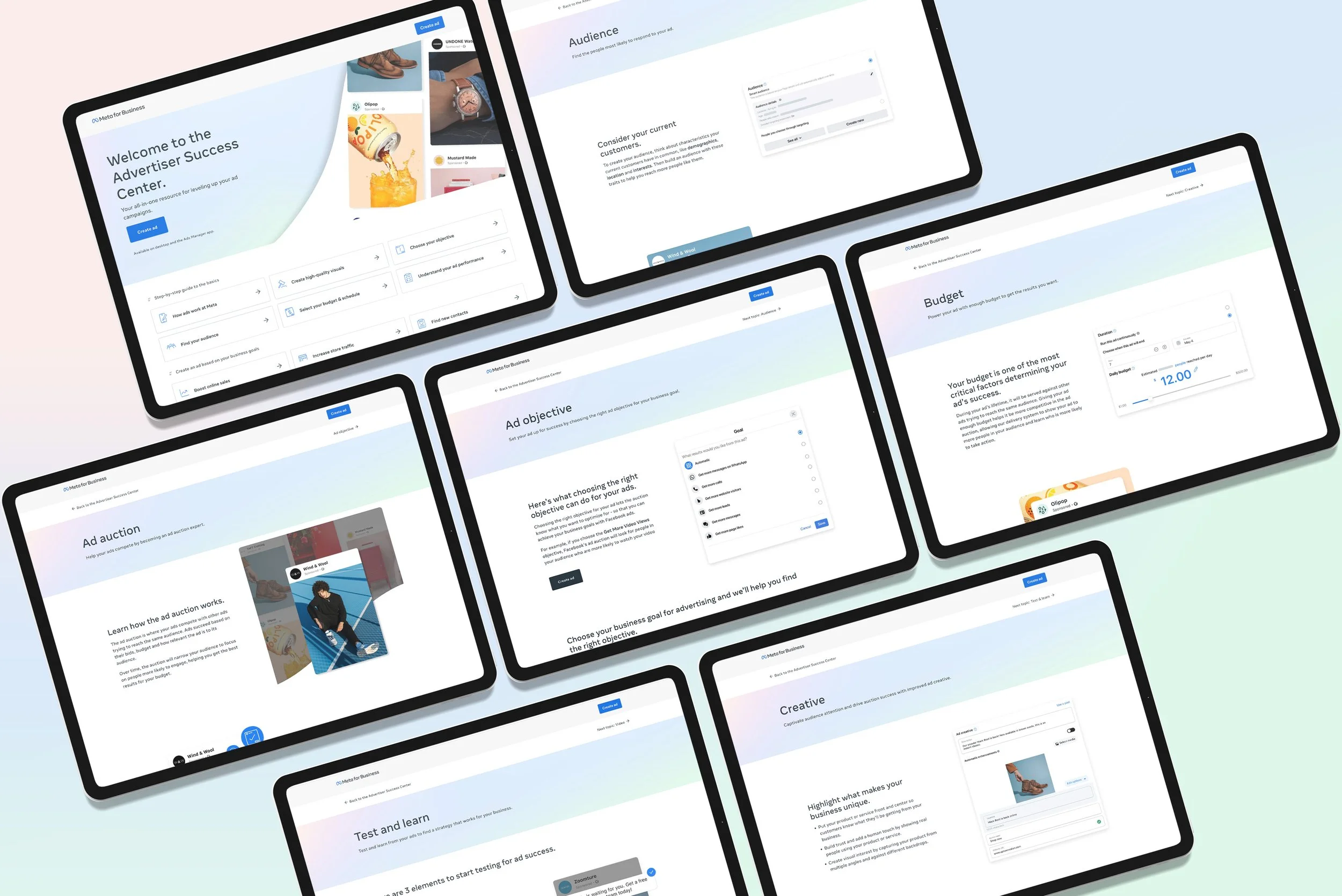
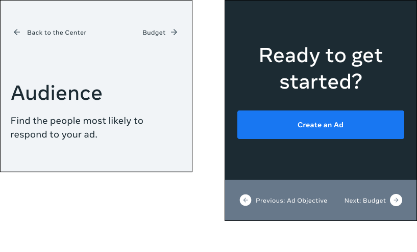
On sub-pages, hero images were removed and replaced with wayfinding organized into sections, optimized for mobile. Real-life examples and product UI elements replaced the decorative imagery.
Navigating without color
With the Meta palette down to six colors, the old approach (one color per sub-page, no functional meaning) wasn’t available anyway. The new system used typographic hierarchy, section structure, and consistent layout to carry the wayfinding load. Color could come back later as a secondary cue rather than the primary one.
Launch
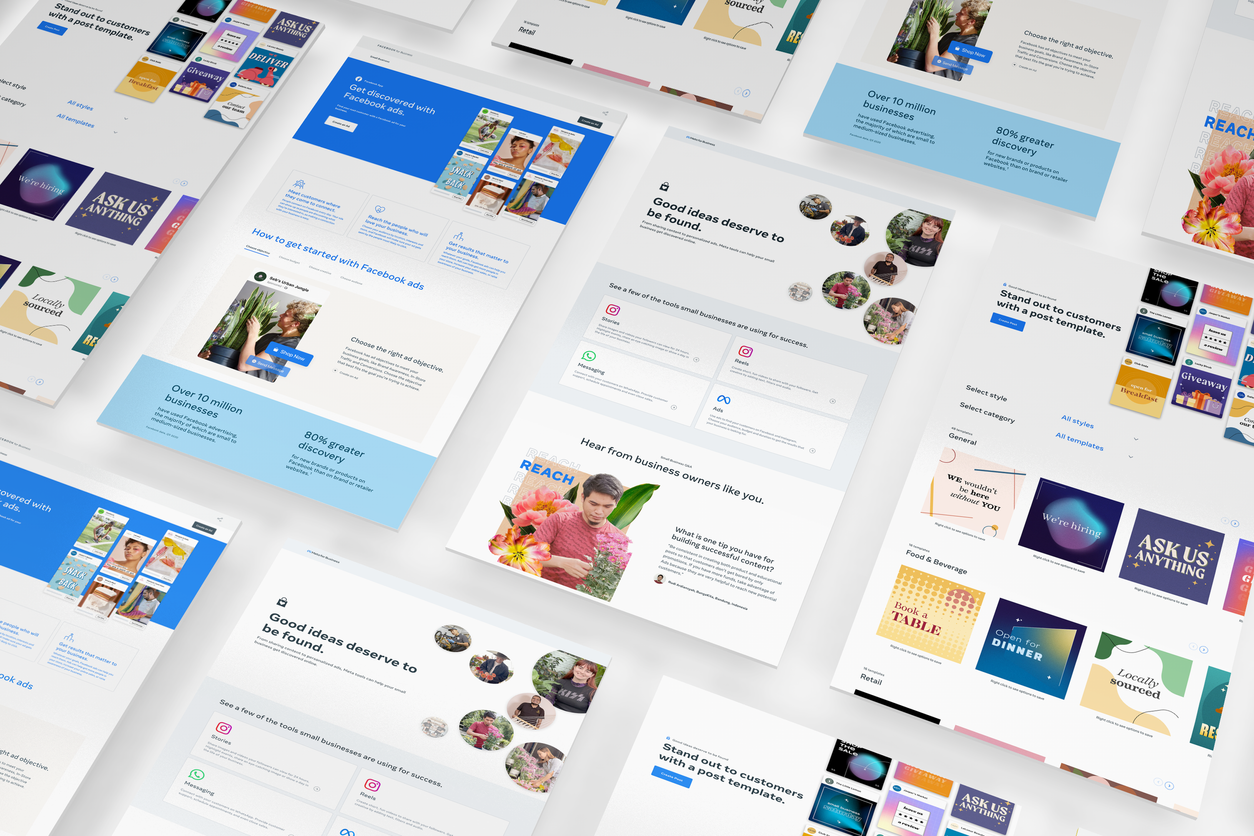
The transition to the Meta brand wasn’t fully documented at the launch of the Advertiser Success Center. Some elements, like the header graphics, had to be built from whatever was available (in this case, patterns of icons). The final design later picked up the Meta gradient and pattern system as those became official.
What I took from it
The skill-tier structure was the kind of IA decision that flatters the platform (we have Beginner, Intermediate, and Pro content) but doesn’t serve the advertiser (I just need to figure out my budget). Replacing it wasn’t glamorous. It was a better map of the territory. That, plus navigation that didn’t lean on color, gave the hub a chance to hold up through future content additions without another full redesign.